The Most Common Problems With School Websites
contributed by Matt Harrell, memberhub.com
Your school’s official website is undoubtedly the most valuable piece of online real estate it possesses. As educators, we know this. Why, then, are so many school websites so bad these days?
Part of the problem is that creating and maintaining an effective school website is a big project that is important but not urgent—so it tends to fall through the cracks. Ownership of the project, too, can be an issue.
While we can’t help you out with these specific stumbling blocks, we can give you a shortlist of some of the top mistakes we at MemberHub see schools making over and over, so that you’re not doomed to repeat them.
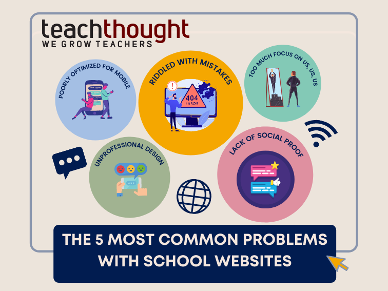
5 Of The Most Common Problems With School Websites
Mistake #1: Poorly Optimized for Mobile
It’s not just kids who are constantly plugged in and on the go these days. Their parents are, too. This means that your website must be optimized for mobile devices.
Every single page of your website should automatically adapt its layout to the size of the screen that it’s being loaded on—whether it’s a laptop, a desktop, a tablet, a smartphone, or anything in between (like those larger phones that are now being called “phablets”).
Not sure if your school website is fully responsive? This is an easy one to check: Just borrow a few different devices—from your colleagues, your kids, the friendly guy you see every morning at the coffee shop, whoever—and browse on over. You may be shocked at what you see (or don’t see).
Mistake #2: Riddled With Mistakes
While it’s never good to have a website up that’s loaded with typos, misspellings, and grammatical mistakes, it’s particularly bad when the perpetrator is a school website. Parents have high standards for the people who educate their kids on such things! Even if you think everything looks A-OK, get a few outside sets of eyes on your website copy to proofread it before the site goes up.
Mistake #3: Too Much Focus on Us, Us, Us
Your school website is about your school, of course. But the secret to a really compelling, effective school website is to present your story (or stories) in such a way that the reader finds himself or herself there, too.
You want folks to be reading your site, nodding along, thinking, “Yes—that is exactly something my kid would say!” or “I would love for our family to be part of this community.” And the way you do this is by sharing stories about the real people at your school—your parents, students, teachers, and administrators. Everyone loves a good story.
Mistake #4: Unprofessional Design
Schools can be tremendously fun places run by enthusiastic, creative people. In an effort to convey this spirit online, however, some school websites go overboard with wacky fonts, emoticons, and colors. The very best school websites are streamlined, professional, and easy to read. This means choosing one or two main colors and fonts throughout. Your school’s personality will still shine through, we promise!
Mistake #5: Lack of Social Proof
If you run a good program and have been around for even a little while, you probably have dozens or even hundreds of positive comments and testimonials from happy parents. Yet far too many schools fail to feature these testimonials in a prominent way on their school websites.
This is a huge mistake, as testimonials make for some of the most compelling marketing around for prospective parents—not to mention current parents who appreciate being reminded in subtle ways that they made the right choice.
Matt Harrell is president and co-founder of MemberHub, school software and communications experts. He is also the technology chair of the board of directors of the J.Y. Joyner Elementary PTA (a proud MemberHub school). Matt earned his B.A. in Computer Science from North Carolina State University in 2000. You can connect with him on Twitter @MattHarrell.
