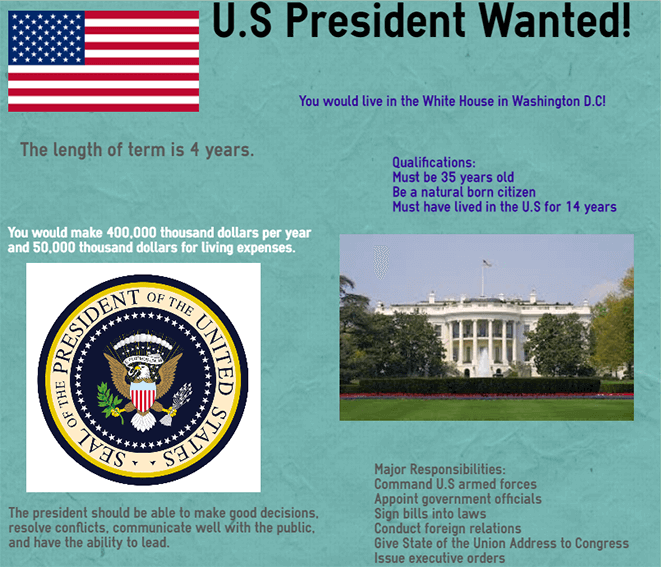
11 Activities Using Infographics And Data To Teach About The Election
by Dawn Casey-Rowe
Are you using infographics to explain or teach about the election? If not, you might want to consider giving it a shot.
The election is a treasure trove for infographics and data representation. There are so many things to analyze during election season–candidates, issues, numbers, polls, statistics–this is the infographic lover’s jackpot. Without visuals, we surely would drown.
The 2016 election is capturing the attention of the nation unlike any other election for a very long time. Take advantage of this to teach about the American political system, showing students how to show off election issues that will make the difference for a long time to come.
How do infographics enhance the election?
You can use infographics to teach candidates’ views, look for patterns and alliances, take and represent poll data, and count delegates leading up to the conventions.
1. Teach candidates’ views
Create infographics focusing on each candidate. Whether you’re creating a timeline of the candidate’s life or looking at candidates’ positions on critical issues, this helps students get to know who’s running. You can do this several productive ways.
Activity One: Assign students or groups to research each candidate, preparing age-appropriate guiding questions for each group, then compile the information and create one giant web-style infographic, showing where candidates overlap and clash.
Activity Two: Have students display the infographic about their candidate, giving a short presentation objectively outlining the candidate’s platform. Prepare a guided note sheet for listeners to record critical facts from each presentation.
Activity Three: After hearing group presentations, have students use their note sheets to create a position statement as to which candidate should be elected. Students can then write a persuasive piece using evidence from the presentations, notes, and infographics.
2. Make a delegate tracker
Many news outlets already have these, but a student-generated delegate tracker means they’ll have to follow the race in real time up until the convention.
Activity Four: Create a spreadsheet or a table with several key states–or if you’re real data junkies, all fifty states. Have students track who’s winning which state, showing the number of delegates he or she has won.
Activity Five: Next, have students or groups create an infographic delegate tracker to display the number of delegates each candidate has captured as the election unfolds. Politico and other news outlets have delegate trackers, but the value here is working with massive amounts of data, unpacking it, and representing it as a class. It’s exciting to see which candidates are pulling ahead.
3. Take and analyze polls
Polls help students understand election issues, but they’re critical in real life, too. Students can do so many things with polls and infographics. Research is a skill they’ll use in their careers, and learning to conduct and interpret polls can be a big part of that.
Whether students design and analyze a simple A/B test or a complex issue-based poll, the results will look like a pile of unusable data until it’s properly represented. Teach students how to sort, represent, then analyze the data. This is something the best CEOs, scientists, and academics do–and must do well.
Activity Six: Have each student or group design and test one election-based question. Teach students how to frame a question so the results will be objective and reliable–and point out examples of leading questions used in the news today. This is a great time to teach lessons on yellow journalism, sensationalism, propaganda, or show students how to look for objectively-sourced news.
Activity Seven: Students should conduct their polls. Require students to interview a minimum number of people. This helps students develop confidence. They’ll quickly learn how difficult it is to get cooperative subjects.
Activity Eight: After students have conducted their polls, teach them data analysis. This is where a quality infographic comes into play, as they’ll need to show off their data once they have analyzed it.
Activity Nine: Students can use their infographics to self-assess by reflecting about the polling experience, examining the quality of their questions as well as the questions of others, and asking “What does this data mean?”
Activity ten: Ask students to display their infographics by posting to a digital or physical walk. Do a virtual or real gallery walk to ask and answer questions about candidates’ records and positions based on the data and poll questions students chose to represent.
4. Predict a winner
Activity eleven: Top off these exciting activities by asking for a prediction. “Who is going to win?” Students will need to pull from all the sources, infographics, and data to predict, then show how they arrived at their conclusion.
Post their predictions and see who wins. It’s a long road to November, but everyone likes to pick a winner. If you teach the elections using research, data, and infographics, students won’t just watch the election on the news–they’ll start to feel a part of the American democratic system.
11 Activities Using Infographics And Data To Teach The Election; image attribution easelly
