When someone sent me this infographic earlier this week, I took a glance at it, then set it aside in a rush of meetings, research, and, well, daily stuff.
But when I took a second look, I was surprised with what I saw.
First, some back story: Infographics have become the content de jour recently, combining eye-catching graphics with data and information. They’re also (often) easy-to-read and understand, which makes them perfect in the digital ecology of 12648126481624 posts and shares per second and general data overload.
At some point, while I can’t say they’ve jumped the shark, they’ve certainly become a bit less–credible, perhaps? Throw it on an infographic, place a “source” in small print at the bottom and call it a day. Say anything elegantly enough and it can seem believable.
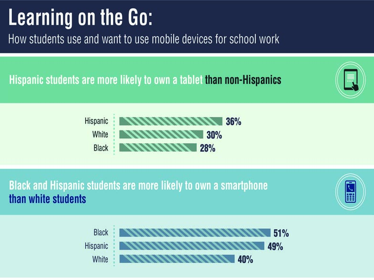
So, with that context I read the following infographic. Having taught in both rural and urban Title I schools, I was happy to see some data that took a look at a kind of intersection between culture and technology, but the data below contradicts my own experience in a classroom, with two statistics standing out:
1. Hispanic students are more likely to own a tablet than non-Hispanics.
2. African-Americans are more likely to own a smartphone than both Hispanics and Whites–by quite a bit (2% and 11% respectively).
Now the trouble with any study framed by race is the implication–even if they’re only perceived. And this trend is undoubtedly geographically dependent (my experience has been on the east coast of the United States).
The relationship between technology use, academic proficiency, and socioeconomic status is an understudied one, it seems. The poverty rate for African American children in the United States is over 37%, while 34% for Hispanics, and 12.5% for whites, according to 2012 Census Data.
The takeaway? Seeing the use of technology–in the classroom and beyond–balance out relatively equally in lieu of socioeconomic challenges. This can only be a positive stepping stone for 21st century learning moving forward.

