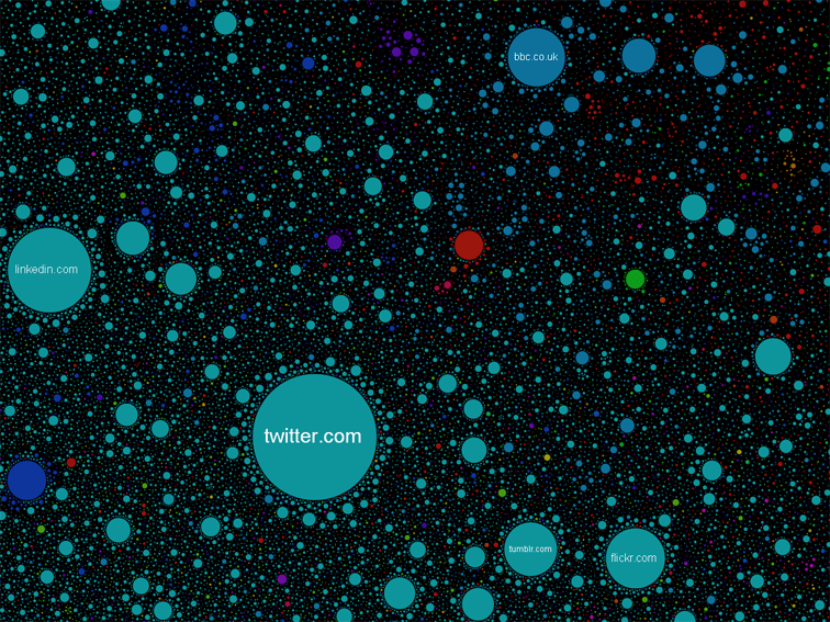
As data becomes more abundant, and technology continues to evolve, how we consume that data will likely decide if we consume that data. We looked recently at the incredible future of data in education, and the following interactive website furthers on the theme of engaging, interactive visual data. It’s beautiful, and frightening. From infosthetics:
“The Internet Map encompasses over 350,000 websites based in 196 countries, which are clustered according to about 2 million mutual links between them. Developed by a small team of seemingly (Singapore based?) Russian enthusiasts, the interactive Internet map is an ‘attempt to look into the hidden structure of the network, fathom its colossal scale, and examine that which is impossible to understand from the bare figures of statistics.’
Every circle on the map stands for a unique website, with its size determined by website web traffic. Its color depends on the country of origin, with red for Russia, yellow for China, purple for Japan, and light-blue for the US.”

